CloudCampus Lead Designer
What the client needed

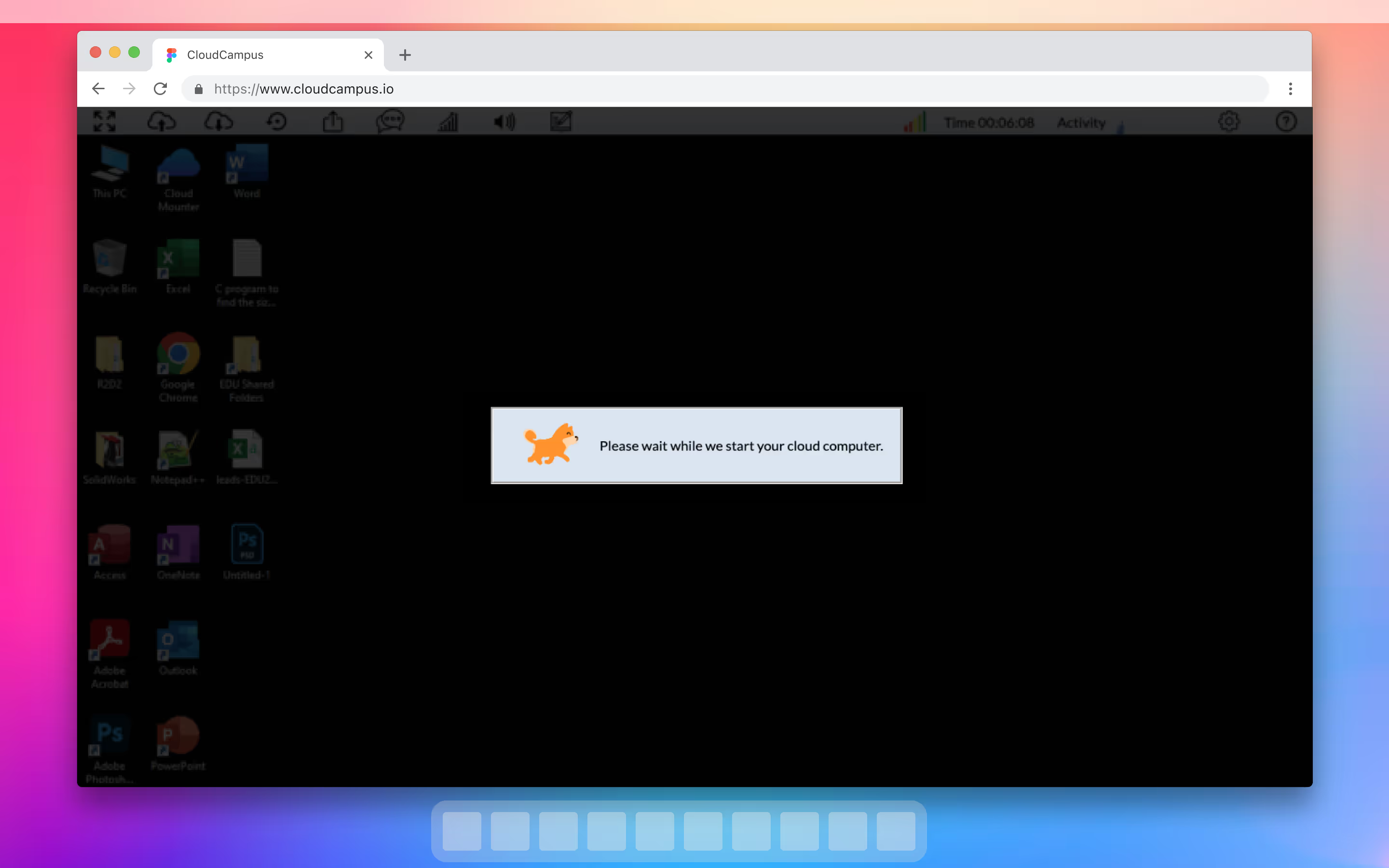
Having been developing their remote desktop educational platform for years without any formal design consultation, they asked for a complete design audit along with a a set of UI recommendations.

How I approached the work

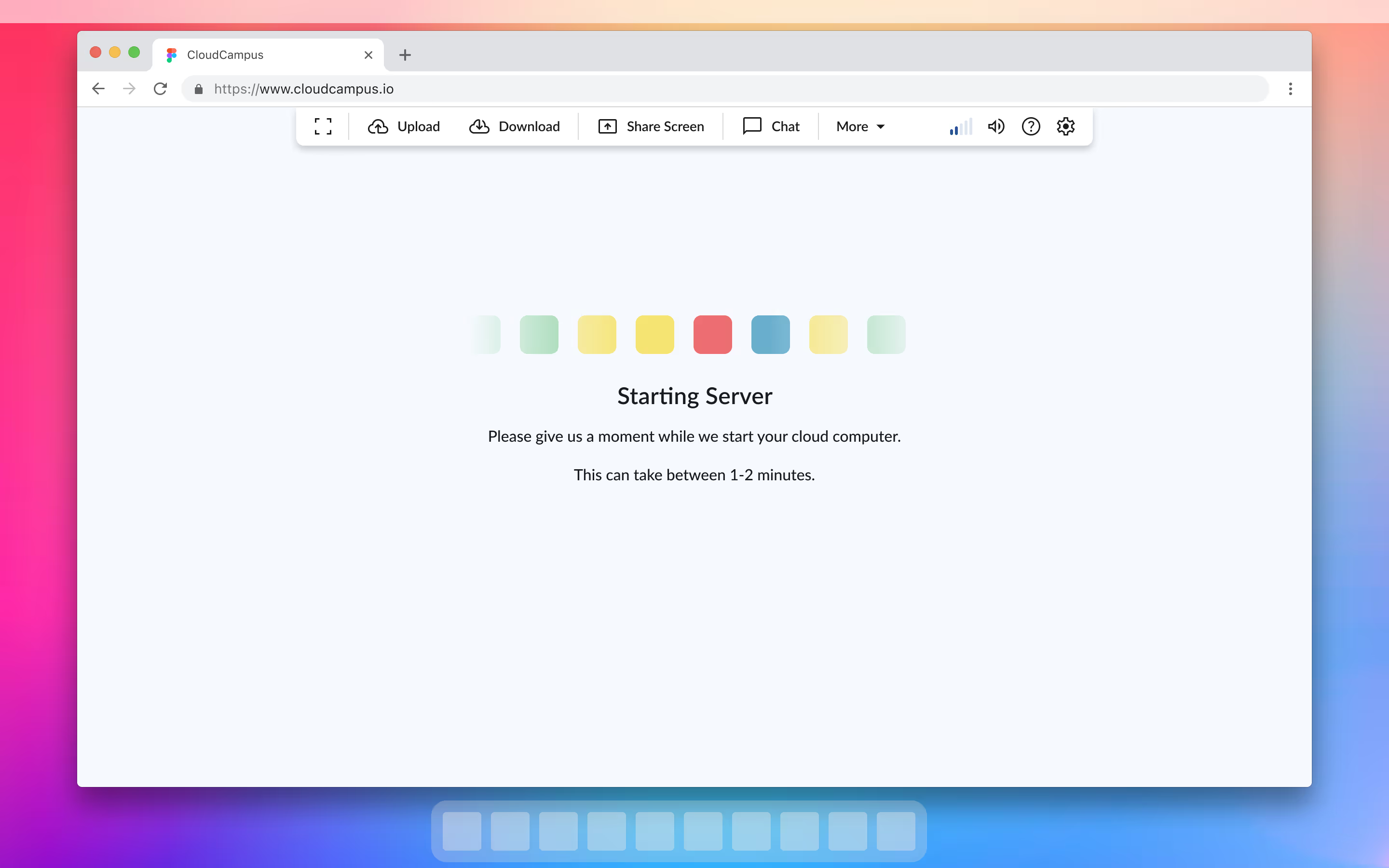
Although the design audit was all that was originally planned — I suggested we expand the scope to include a full interface redesign of the product.

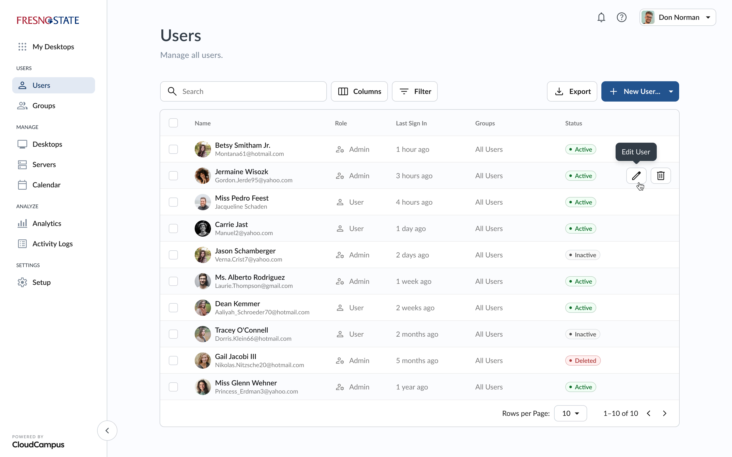
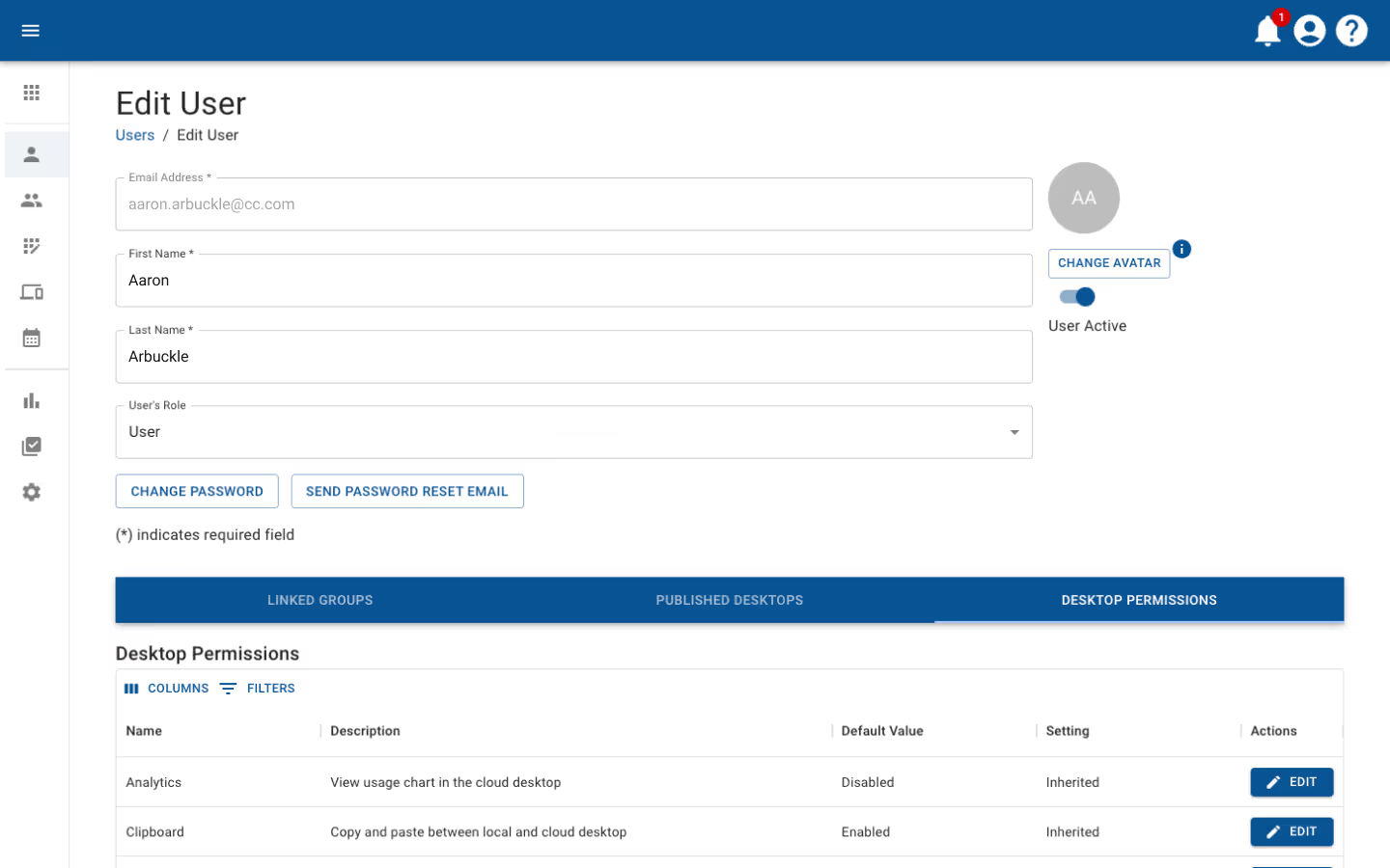
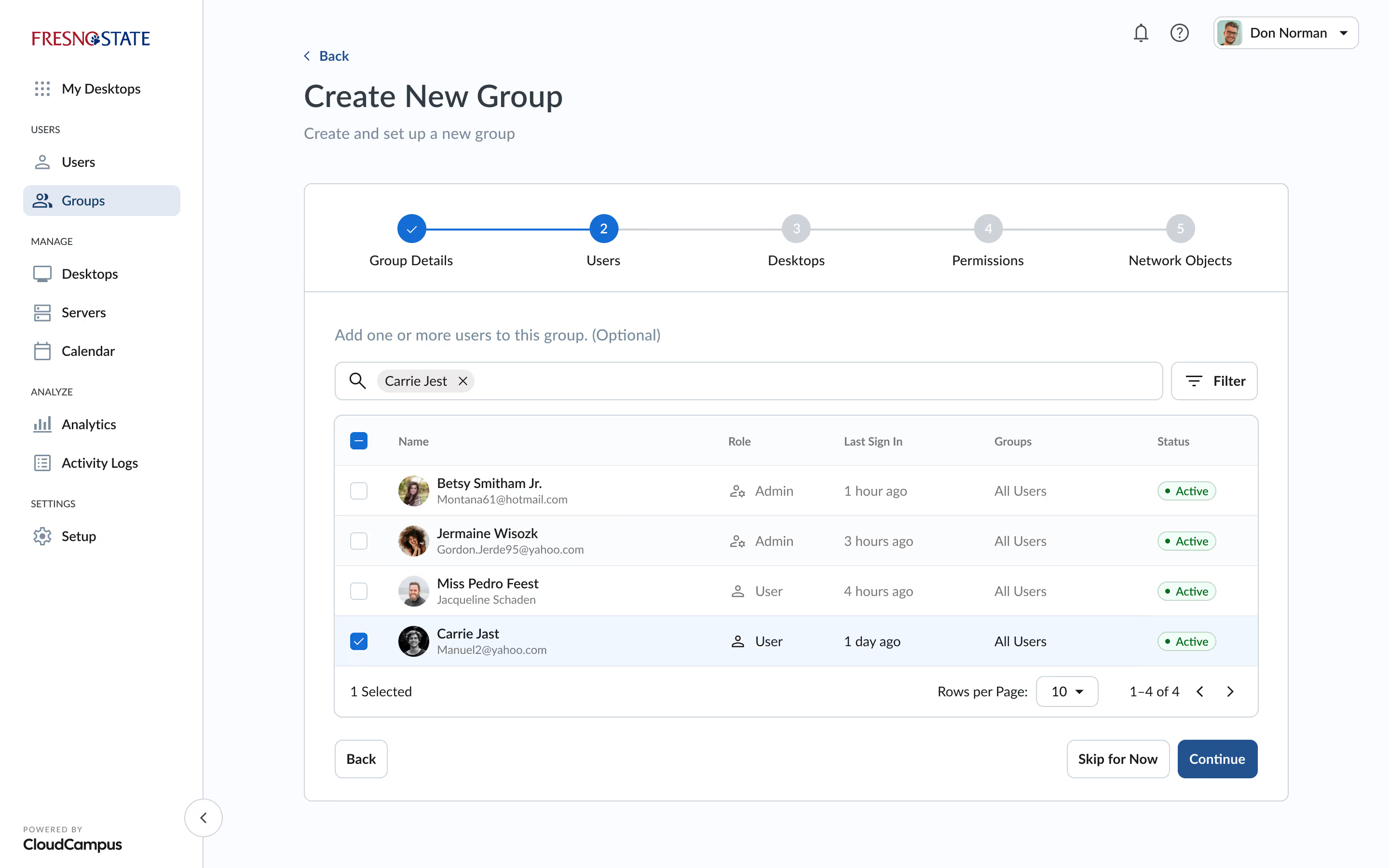
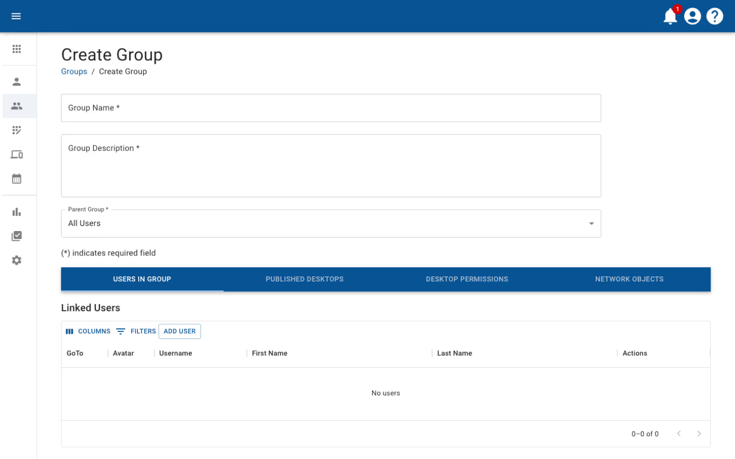
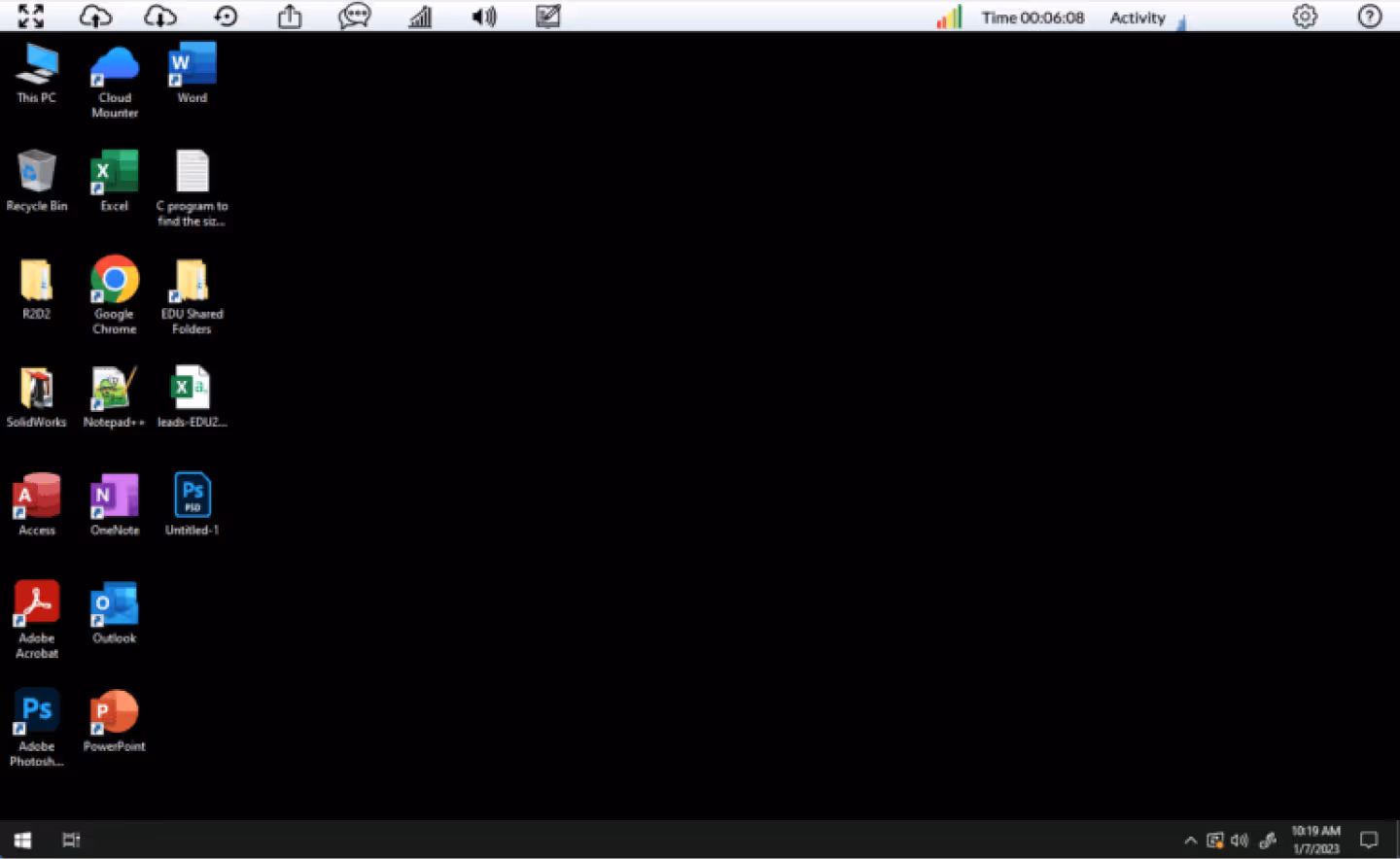
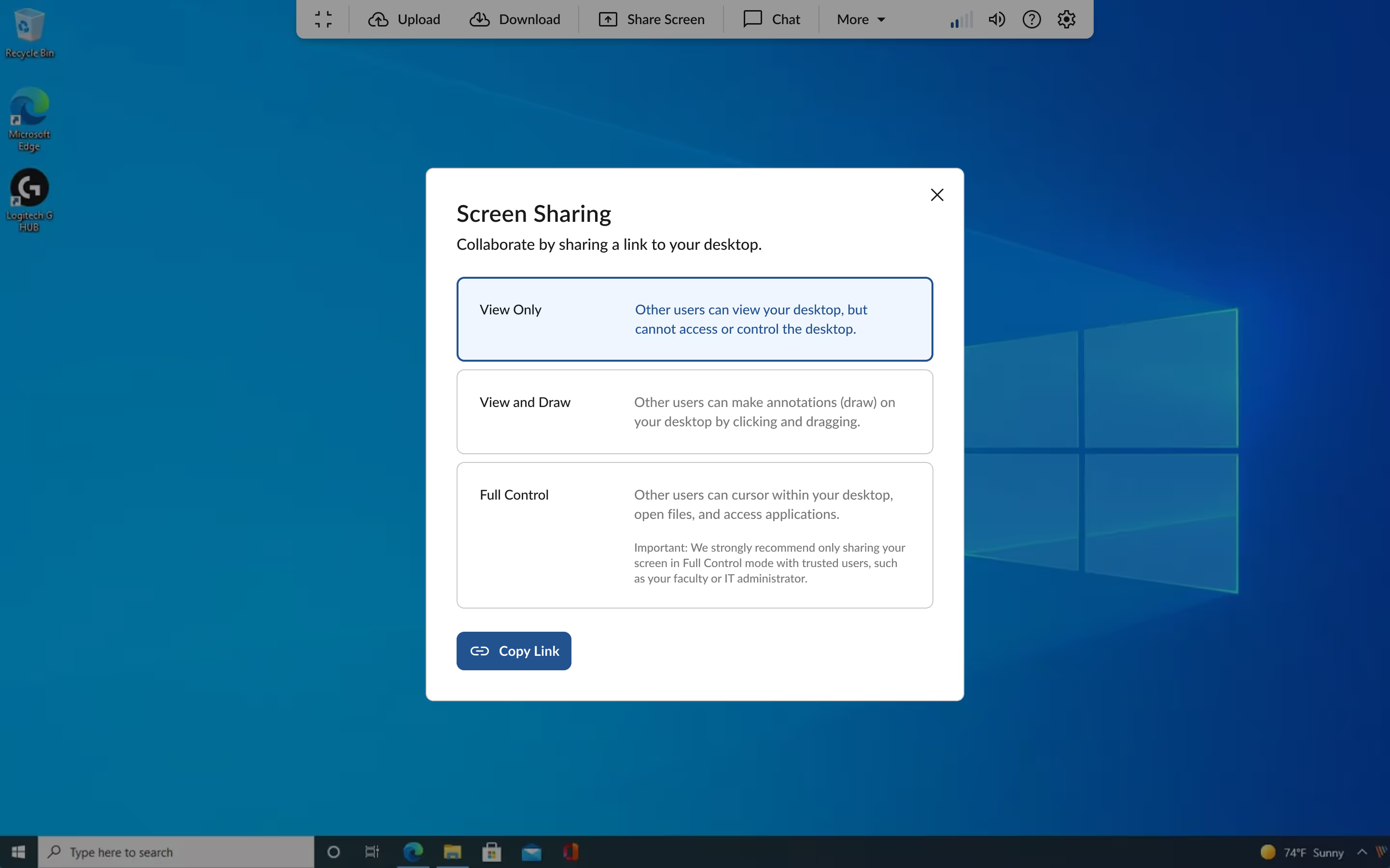
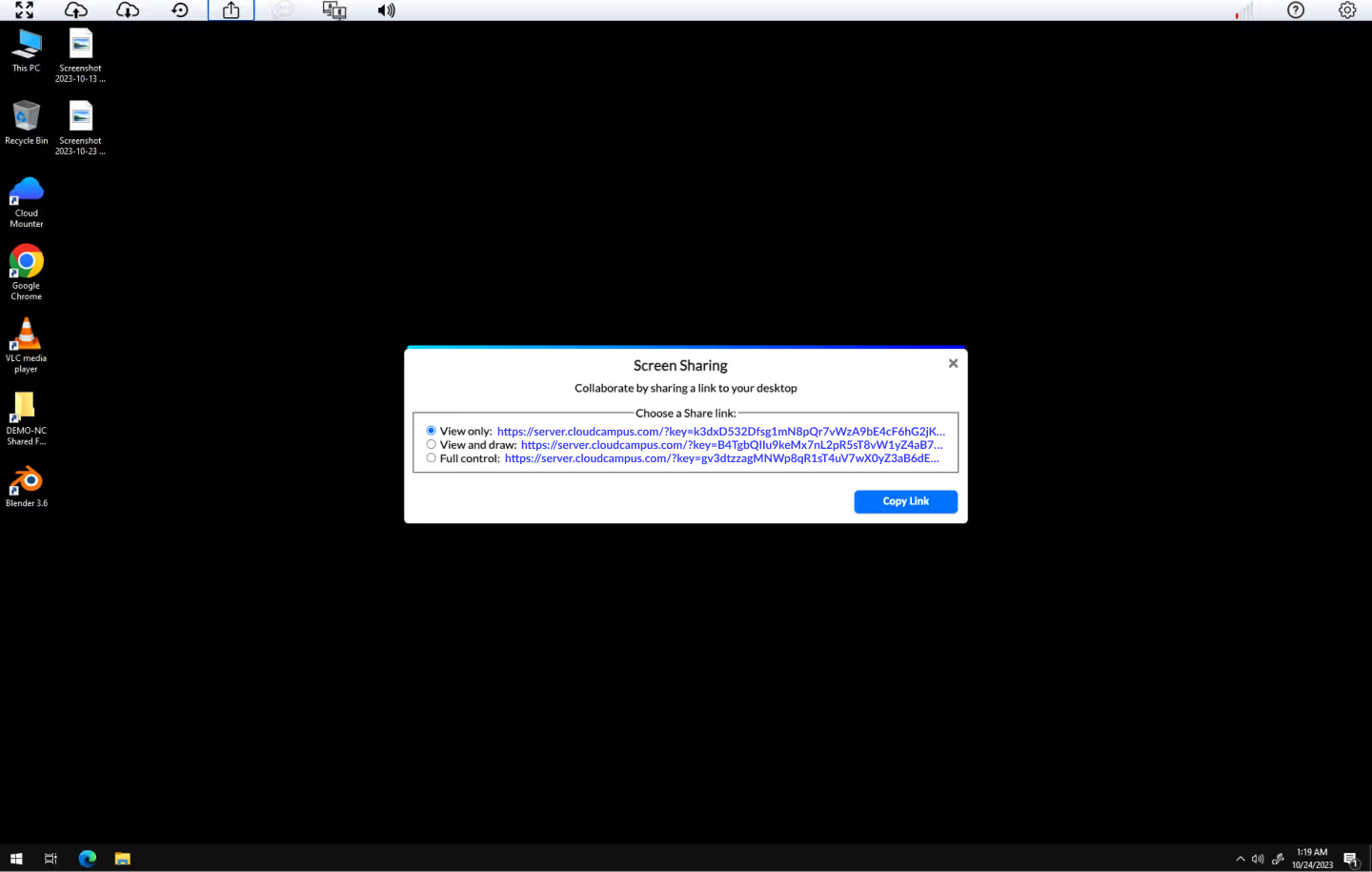
The platform at its core seemed very usable (as evidenced by their customer base count), but was lacking in a fundamental refactor in common best practices, both from a development and user-oriented perspective.

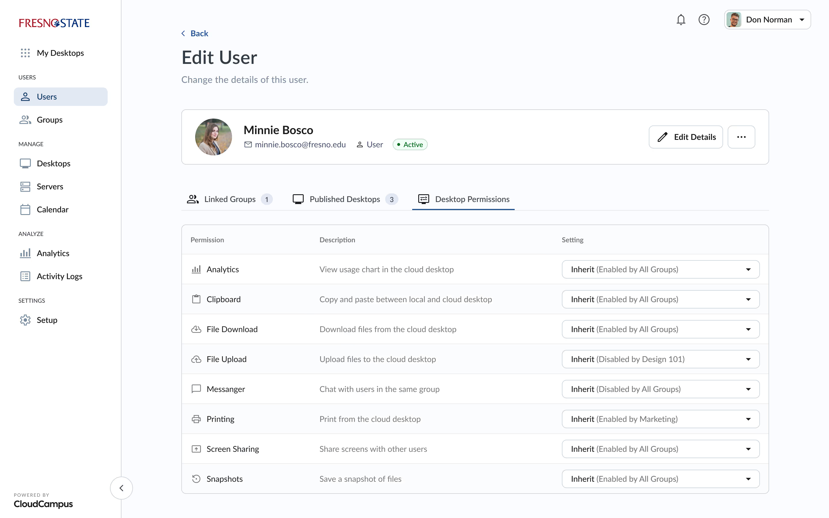
Researching their existing analytics allowed me to make clearer decisions on how to restructure core areas and introduce new refactored standards that could be ready for out-of-the-box utilization for any upcoming features and ongoing user needs.

Tru Identity dashboard screenshot
👇 Here are a few snapshots from my process and decision making
Tru platform user guidance user interface
Currently in development
Admin: Users

With the redesign, I opted to structure table pages (the primary view for most features in the sidebar) with a clear distinction between the toolbar (actions pertaining to the entire table) and the table data itself. Here for example certain cells provide for combined data to reduce columns and improve scannability, while row-level actions are displayed on hover to reduce cognitive overload.

Tru platform onboarding user interface
Past
Admin: Users

There were several issues present from the get-go that I addressed in detail via the delivered audit. To name a few these included: a lack of information hierarchy in general, a lack of emphasis on which data is more relevant than others in tables, an overuse of primary buttons, and a lack of human-readable elements.

Tru platform user guidance user interface
Currently in development
Admin: Edit User

In this example I created a distinction between content that is less often changed (like the user’s name) and settings that are more likely to be edited by administrators. This streamlined approach provides for an increase in readability and access to the most important settings.

Tru platform onboarding user interface
Past
Admin: Edit User

Most of the admin capabilities were screens that looked like this. While a lot of these parameters are functional, what’s lacking is a clear hierarchy of what content is primary, and which is secondary. If everything is of equal importance, we lose emphasis on what’s important to the user — namely the most frequently used parameters.

Tru platform user guidance user interface
Currently in development
Admin: Create Group

To help establish a reusable design pattern for the action of creating new items (users, groups, and so on) I opted for a flexible stepper system to guide admins and provide contextual copy for each step. The data can always be changed later, but in this way I provided a level of progressive disclosure to ensure users get the sense they have walked through each step in the process.

Tru platform onboarding user interface
Past
Admin: Create Group

In many instances the action of creating (as opposed to editing or viewing) wasn’t distinct, which resulted in states looking very similar across the product. This approach can not only lead to confusion for the end-user, but also reduces the clarity of what actions are being taken as an admin.

Tru platform user guidance user interface
Currently in development
Remote Desktop

My approach was create a clear distinction between the UI (menu bar) and the remote desktop students are logged into. Here I focused on adding labels, selecting a unified icon set, and visually grouping similar features together. Another important decision was what to actually include as most-used actions.

Without the time or budget for extensive user research, I was able to take a look at the numbers of interaction for each element to at least get an idea of how to establish a new hierarchy of features.

Tru platform onboarding user interface
Past
Remote Desktop

When students would log in to their account, the remote desktop experience is the primary interaction for the end-user. The existing menu bar design tended to have all available features stacked without any categorization or hierarchy of importance.

Tru platform user guidance user interface
Currently in development
Remote Desktop: Screen Sharing

I regularly pulled from their live online documentation which included useful information for the end-user to increase clarity and usability. I included copy to help establish definitions for the displayed features.

Tru platform onboarding user interface
Past
Remote Desktop: Screen Sharing

There were several obvious refactors that needed addressing, such as unifying commonly used components such as modals throughout the experience.

Tru platform user guidance user interface
Currently in development
Remote Desktop: Initiation

In order to provide more contextually relevant information, I once again pulled from information from the client’s own online documentation — giving the user an estimated wait time and introducing a subtle animation with elements from their branding.

Tru platform onboarding user interface
Past
Remote Desktop: Initiation

There were a few instances of oddly out of place elements that were not inline with the branding the client was wanting to achieve. For example, while waiting for their remote desktop to launch, students were met with an animated gif of a dog.

See more work
Tru Identity Inc.
Shaping the future of supply chain management
View work →
Tru dashboard screenshot